The project
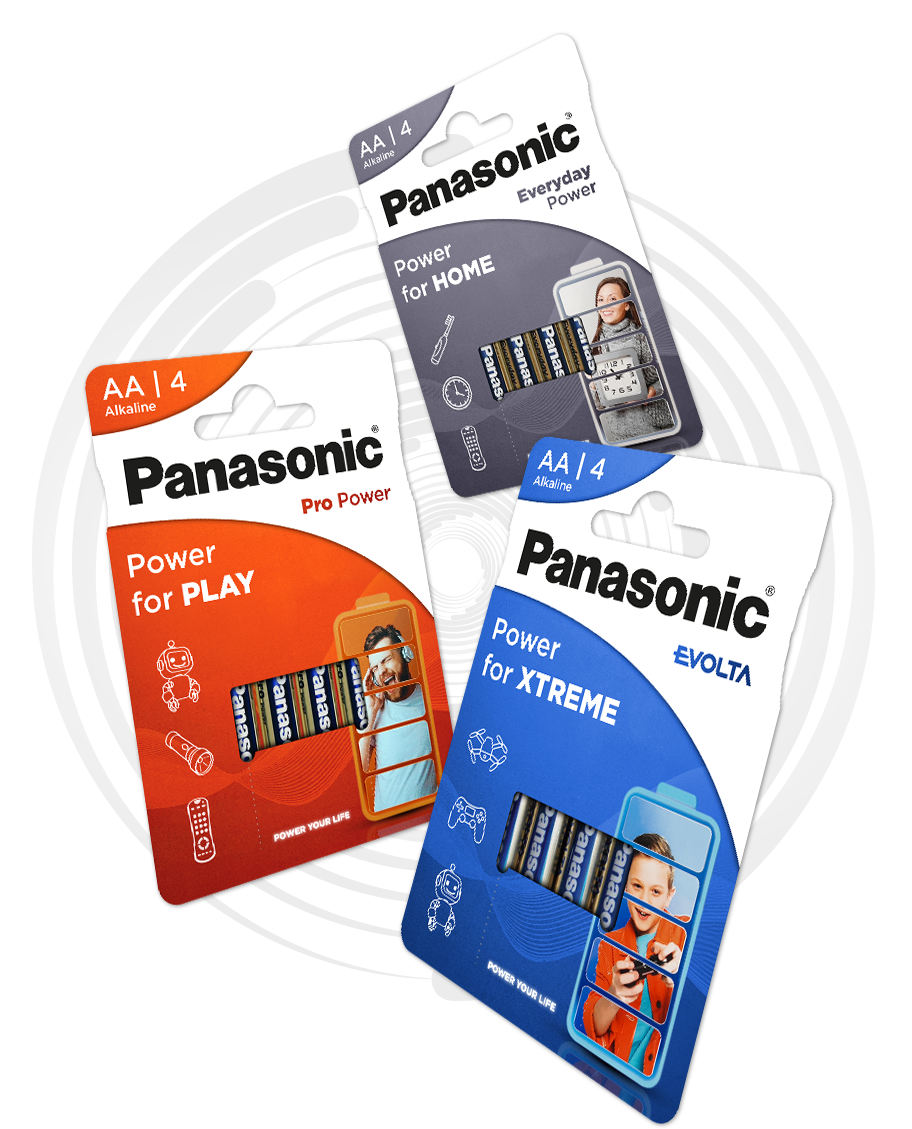
Redesign of Panasonic battery packaging layout and Panasonic batteries communication style. Research showed that consumers found the current pack designs (and also most competitors' packs ) too chaotic and on-pack communication on guidance was not reaching them.
Target group :
mainly couples with small children.
Key features :
convenience, guidance on appliances, trustworthy.
My role in this project
Complete redesign of packaging layout and communication look & feel. This brief was also given to 3 external agencies.
Project constraints :
keep blue, red and grey pack colors + keep white 'trumpet shape' with Panasonic logo (= Panasonic HQ rules).
Challenge :
How can I make the pack stand out versus competition? How can I make the pack layout less cluttered and add clear guidance? How can I merge this with the constraints given by Panasonic HQ?
Solution :
Simplified design with hero image, appliance icons and a clear guidance claim.