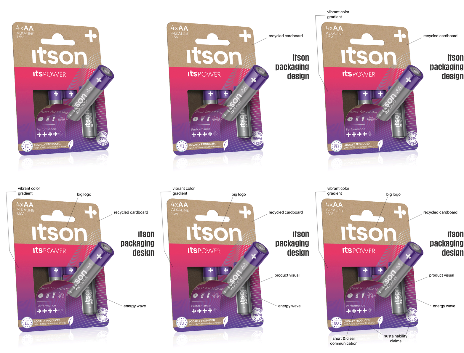
The project
In 2023, along with some colleagues from the APS Marketing Team, I had the opportunity to develop and design a new battery brand: itson. Initially we collaborated with an external agency to define the brand name, the target group and the tone of voice of the brand. After that, the translation to packaging design, POSM design and online and offline communication materials was mainly done in-house.
Target group :
mainly young adults, environmentally aware consumers with an active lifestyle.
Key features :
eco-friendly packaging, local production, premium, active, energetic, young, fun.
My role in this project
Create an impactful packaging layout for itson batteries that stands out in shelf among competitors and that convinces consumers to choose for itson over long known brands, also taking into account the eco-friendly characteristic of the itson packaging. Ensure the on-pack communication is clear and easy to understand for consumers so they choose the right battery for their needs.
To optimize the pack design, we joined forces with iVisual, an agency that has expertise in color science, design semantics, predictive intelligence and behavioural insights.